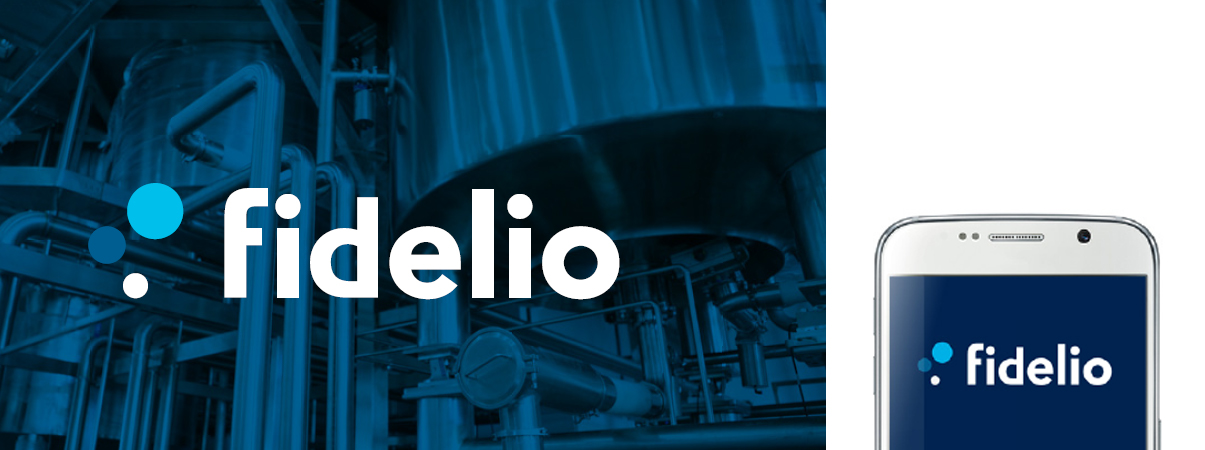
The Fidelio team is very happy to introduce its new logo! This change echoes new developments in the company and constitutes a milestone, as much for our employees as for our customers. And no, we’re not modernizing our logo on principle only, but rather on the premise that 2020 is going to leave an indelible mark on the Fidelio timeline. It is, therefore, with great pleasure that we present you with this article on the natural evolution of our brand.
2020, A Historic Year for Fidelio
The Fidelio logo, which has been used up to now, was created about 15 years ago. Already back then, Fidelio wanted to proudly showcase its technological innovations which were right up there with the major international players. The shades of blue, the clean lines and the basic typography were in line with the code followed by many other IT companies. It was an effective means of signifying that we belonged to the same world.
Fifteen years later, though Fidelio is still cutting-edge and continues to hold the same values, it has evolved:
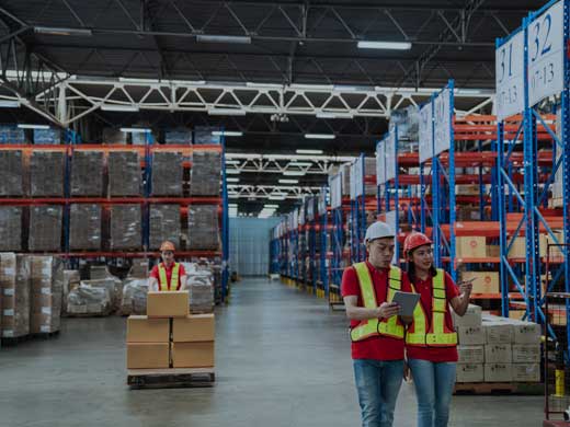
- Our renowned expertise in the manufacturing, distribution and agri-food sectors is now enhanced.
- That we are mature and at the forefront of technological change is demonstrated by the upcoming release of our new generation Fidelio software.
- We are expanding into new markets, outside Quebec.
- Our team is more than sixty members strong and still growing despite the present economic slump.
- Our customer base includes more than 400 companies.
In view of the upcoming release of the new generation Fidelio, our team acknowledged that the message and image of the Fidelio brand no longer corresponded with what we wanted our new product to say, with how our company had evolved and with our business objectives. We had to find a solution.
So We Decided to Change Our Look!
You heard right, our company is growing and our current visual identity no longer represents who we are. The too-often used cube doesn’t allow us to stand out and the colours lack luster. In short, it is no longer who we are and it does not reflect our modern, avant-garde and dynamic identity.
We have designed a new image that better reflects our contribution to our customers, our partners and our employees: innovative ERP software that is easy to use and reliable. A case in point is the release of our new generation Fidelio this year: ERP software that is 100% cloud-based with a modern and intuitive interface, new functionalities for business intelligence, sales and customization developed in line with customer returns, just to name a few of our new offerings.

The new generation Fidelio also proposes a new business model with SaaS (Software as a Service). It is more flexible and easier to use. Plus, the all-inclusive monthly subscription is all you need as it provides access to the software, hosting and support.
Our New Logo Asserts Our Identity
We have selected a logo that is bolder and that allows us to position ourselves as a fresh player that is yes, dynamic, but also stable and reliable.

Why fresh and dynamic? Because these qualities set us apart from our competitors. The ERP software market is indeed composed of numerous players including several large companies, often multinationals. Their well-established brands often dissimulate rigid processes and sometimes complicated functionalities. When we created the new generation Fidelio, that’s exactly what we did not want.
The three cloud-like bubbles represent Fidelio’s role as a springboard to achieving new heights. As with a chemical solution, it's the key ingredient that initiates the reaction, magically creating synergy among the molecules, whose organization, in turn, generates a stimulating effervescence.
- Three bubbles to represent the three faces of the cube in our previous logo.
- Three bubbles that evolve together much like departments in a company that exchange information and work as a team.
- Three bubbles, like the fluid organization of data in the cloud.
- Three bubbles, as with thought bubbles...strategic thinking.
As for the colours, though similar to the preceding ones, they have clear differences. More vivid, they create a splash of light, and yet project a practical and professional image.
Stability and confidence are well-represented by the change in font that thickens the letters. The dark blue colour inspires confidence, loyalty and security: three values dear to Fidelio.
In the course of the coming weeks and months, you will discover the new visuals that represent our new identity on our web site, in social media, in the news and even in the software. Despite these changes, we're the same Fidelio team — we simply have a stronger new identity that we hope will be even more recognizable as we continue to reach new heights!
If you have more questions, do reach out to us.


.svg)